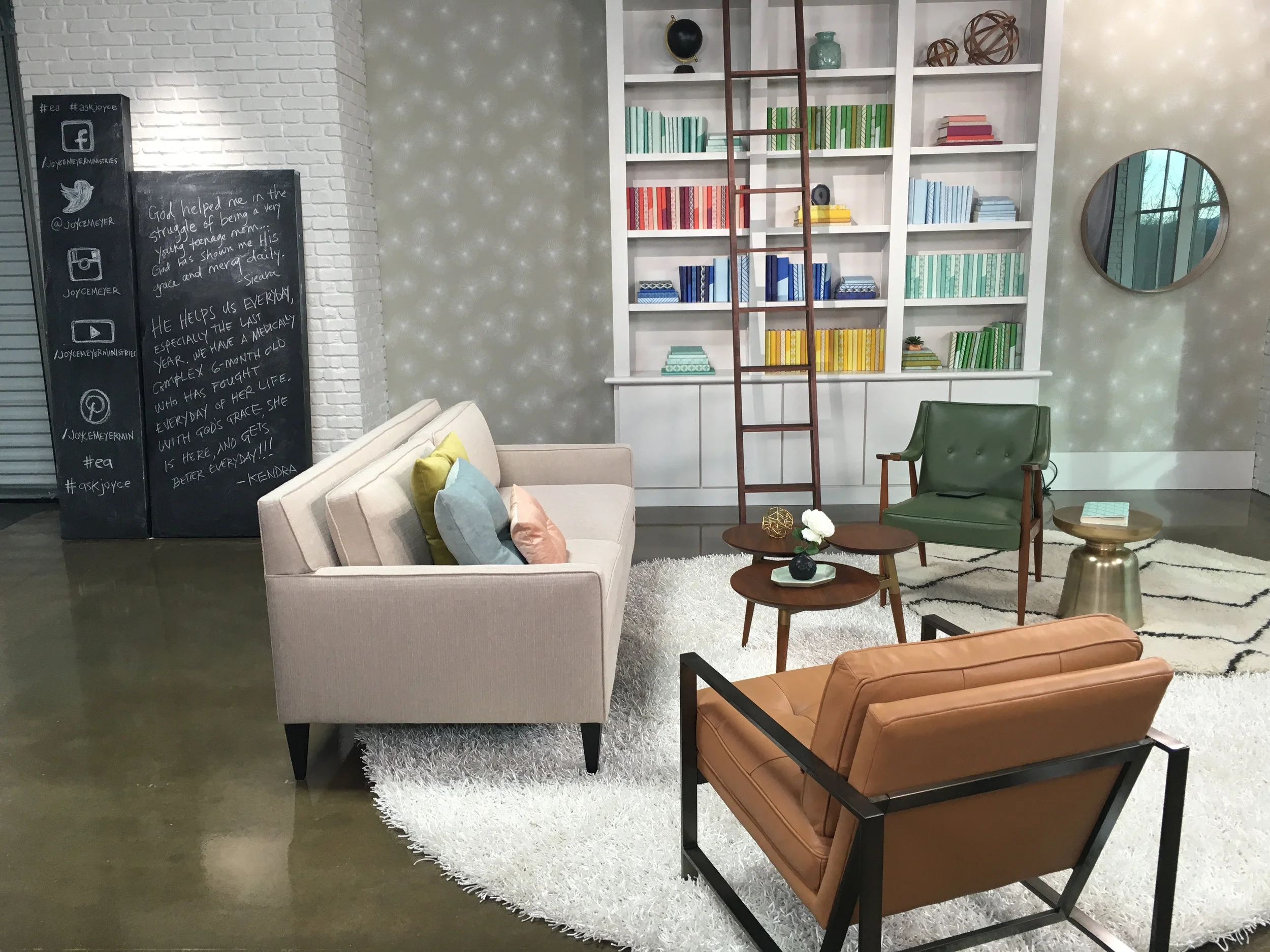
Welcome to Vintage Modern Studio B
One thing I learned at Joyce Meyer Ministries, was the genius of set design. Studio A, which is home to Enjoying Everyday Life, is spectacular mix of moveable walls, glowy lights and cameras. When plans for Studio B were underway, I was excited to design the studio’s interior and lead the team to completion. The master team who went before my part began: Ginger Stache, Steve DeShetler, John Pipes, Lonnie Turnbeaugh and Joel Turnbeaugh. They transformed a corporate break room into a gorgeous loft studio, maximizing every inch and penny.
Planning


Demo + Construction

After demo and paint, the space brightened up significantly. Faux brick added for texture.

A garage door was added for an industrial look, but also for flexibility to move equipment and walls out.

Corporate windows transformed to feel like loft windows.

Faux staircase, windows and walls added to create depth on camera.

All faux walls were on locked wheels, completely moveable so the space be customized as needed.
Interior
The goal was to design white loft space with vintage mod influences. The two focal points of the studio would be the kitchenette and sofa seating. (And since this is a mommy blog, I will share my maternity-leave secret crush: Vivian Howard’s blue tile in Chef and the Farmer. Maybe I watched too many episodes at 3am feedings? I don't know, but I was hooked. Ginger Stache would look gorgeous against a blue tile. So there you have it.)
Wardrobe
Final Studio B
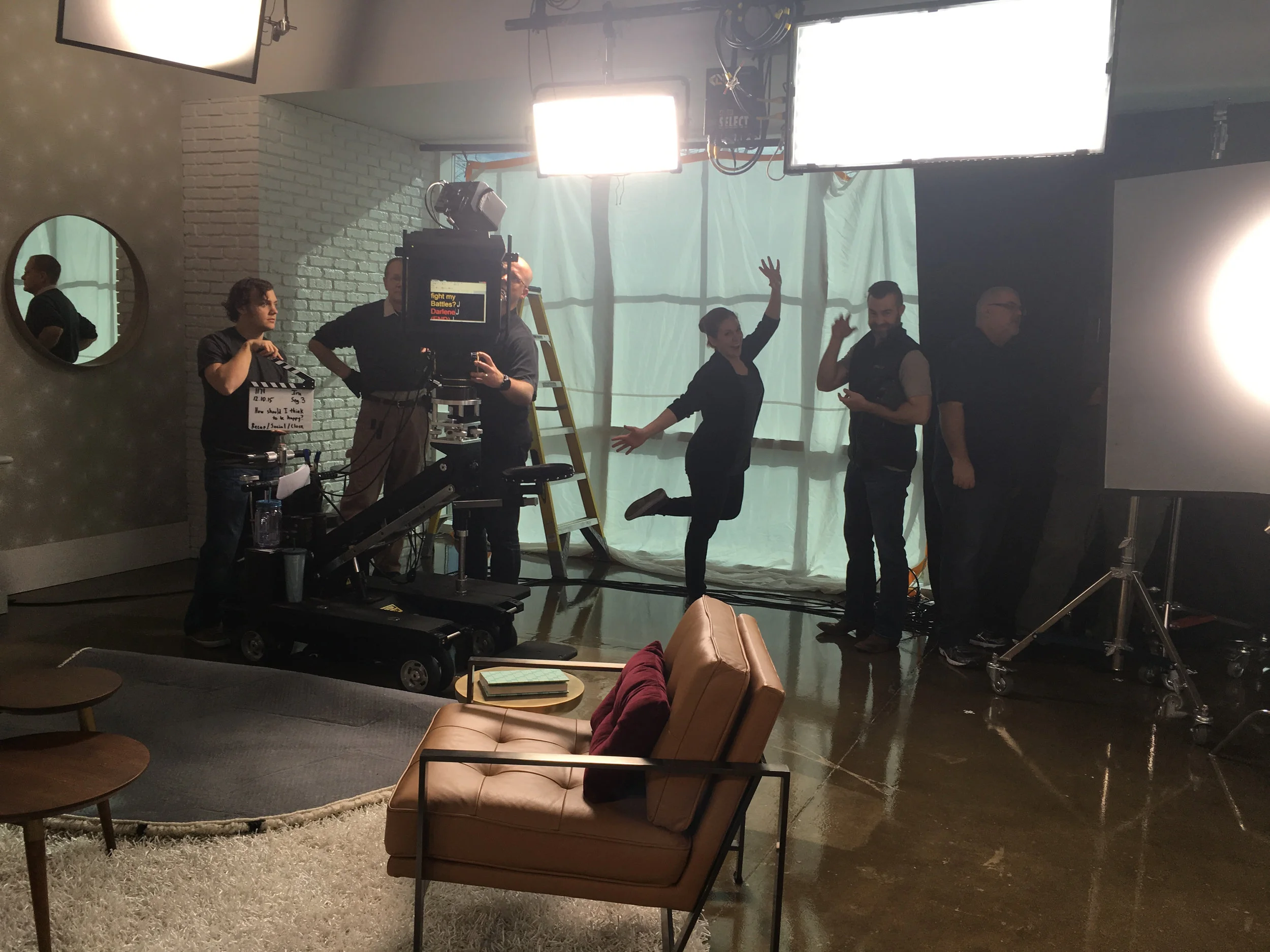
Behind the Scenes
A shout out to these awesome creatives who helped style, prop and shop: Amber Majors, Amy Roff, Jeri Iceness, Jeff Douglas, Stacy Council, Nick Martin


